TerpRoots aims to produce ways to connect current and incoming Terps to traditions that have existed for years!

Learn More!

What is TerpRoots?

Through a virtual platform that enables our primary target audience, students, to post theme-based pictures and videos at Maryland events, TerpRoots aims to develop a friendly camaraderie between students where they are more eager to attend traditional Terp events after becoming more connected to the College Park community. We plan to incentivize posting content on the platform by awarding students with the most popular posts different things like free food vouchers, free tickets to events, free Maryland apparel, and more! As the system expands, we plan to include parents, visitors, and faculty members because everyone should be able to experience and enjoy the Terpdition (Terp tradition) experience!


Large Functionality, Limitless Fun

Check out how TerpRoots works!


Usable on Multiple Devices

Ready to use on mobile devices and on the web!

Camera Use

Take a picture using our hashtags and filters to show how excited you are for an event that is coming up!

Incentives

Most popular content creators will receive a prize at the end of the event!

Unlocking the Community

We need YOU to decide what content should be recognized for embodying our Terp spirit!

One to two weeks before an event, we will post themes, hashtags, and filters on the platform to engage with students and get them revved up for the event! The platform would be compatible with existing social media platforms: Twitter, Facebook, and Instagram. As posts are fed into the platform, students and surrounding members of the community will be able to like or vote for a post they like. As we get closer to the event, we plan on releasing what incentive the top post creators will receive. We will push out more engagement tools and set content engagement to be worth more points during the event than before the event. At the end of the event, the top posts will be announced and students, faculty, visitors, or parents who created the top posts will be able to claim their prize.


Stop waiting.
Start revelling.

Let's Get Started!


We Terp Traditions!

Why TerpRoots Matters

Many describe college as being the best time of their lives. It’s a time where we learn more about ourselves, figure out what we want to do professionally, and determine what is required to get there. College is a time to make an abundance of mistakes and learn from those mistakes. Additionally, and most importantly for our platform, college is a time to live life and make amazing, unforgettable memories. At the University of Maryland, there are a host of traditions that have permeated through the years and have made campus life more vibrant.

From rubbing Testudo’s nose or the Big Ten Kick Off to The Flash Mob basketball game, Homecoming, Or Art Attack, there are countless traditions that help students enjoy themselves and balance out the stresses of academic rigor. Recently, students haven’t been participating in Terp traditions. Attendance at athletic games has been lower, students have been skipping the Big Ten Kick Off, and Art Attack, or events at Homecoming, have an inconsistent number of people in attendance. With this being a high-tech generation, we believe our platform will allow revamp traditions by allowing students, faculty, visitors, and parents to engage with one another regarding these events and to incentivize attending and supporting these events.


Contextual Analysis


Analyzing our target audience


Initial Research:


Prior to contextual inquiry, our team collaborated on creating open-ended questionnaire and outlined the questions that we hoped would best uncover and address the root problem. We also did our research and looked into potential stakeholders to interview. Organizations on campus such as SEE looked hopeful. Our focus for interviewing stakeholders centered around finding the people with connections to the school’s organizations. Our focus for interviewing our target audience was slightly more open ended, as we were able to approach fellow students, parents, and faculty. We planned to observe traditions on campus for the alloted one-and-a-half hour observation requirement. Some traditions that we wished to observe are as follows: the rubbing of Testudo’s nose, coordinated cheers from the student body at basketball games, and swimming in the fountain in front of McKeldin library.


Feedback from our audience regarding Maryland events:


“I really like the lacrosse games! We get more attention when we’re outside where it’s warm.”           


“If I don’t take part in something it’s either due to distance or a commitment to other priorities.”           


“Finals week at Testudo is hilarious even though I’ve never sacrificed anything, but I love the enthusiasm, creativity and humor that goes into desperation.”           


“I do it for the t-shirts. Free gear. Free food.”           


“They're okay. Could be more diverse.”           


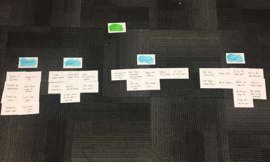
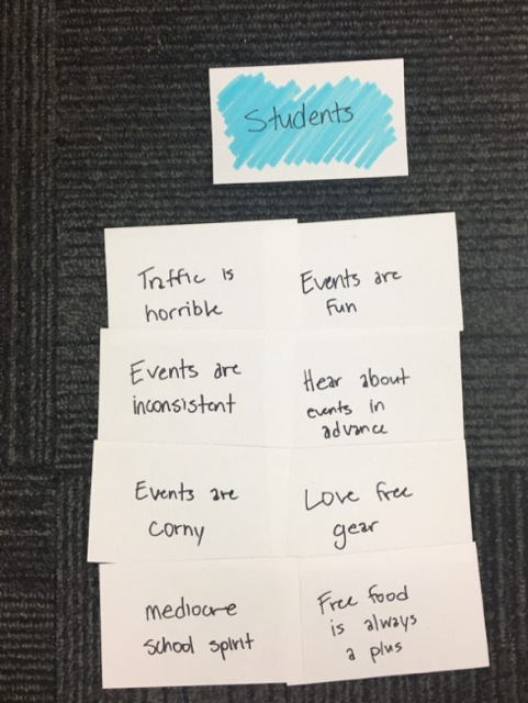
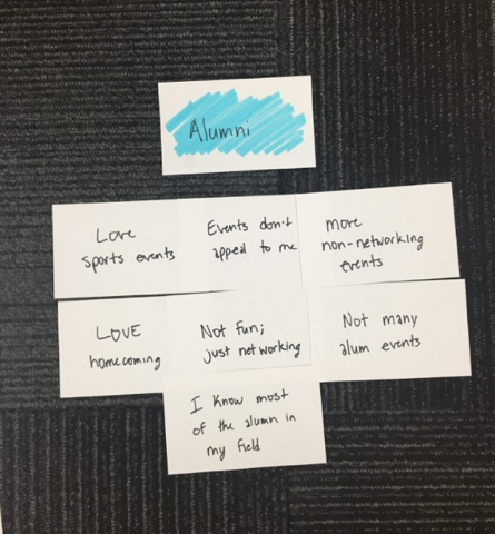
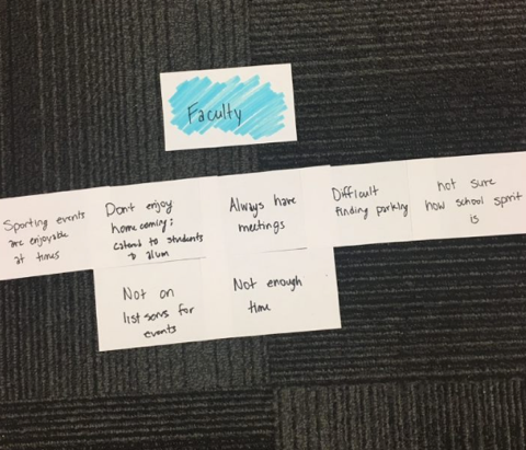
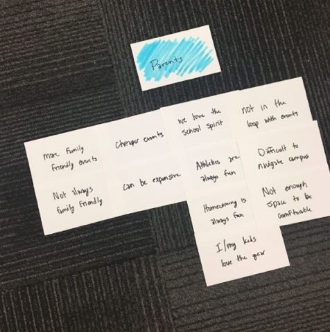
Work Affinity Activity Diagram:


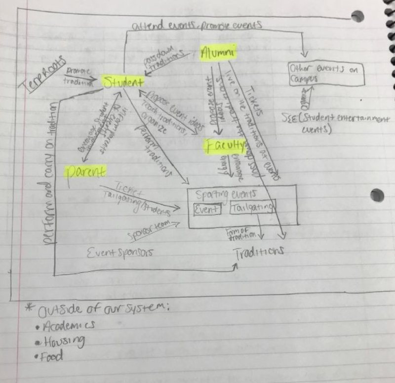
Work Flow Diagram:


Personas & Design Alternatives


Identifying our users & showing the platform's initial design


Persona:


The persona that we are designing TerpRoots for is a freshman who is very involved on campus in different academic societies and extracurricular activities. This freshman wants to attend more events but is unable to attend some of the most popular events because the student is very busy managing academics and their other obligations. Additionally, the student’s parents are University of Maryland alumni as well. They would love to attend traditional events with their child, but the student is really busy, so they don’t see the point of attending without their child; additionally, they have younger children and some of the events aren’t as accommodating to younger children. The student is often working through the late evening, as they are conducting undergraduate research with a faculty member in the Clark School of Engineering. The student and faculty member often talk to each other about events going on around campus, but they never go because they are really invested in their academics/research. The student always hears about events from friends and peers afterwards and is always regretful. The student is out of the loop on when events are, where they are, and other pertinent information, so the student exerts copious amounts of energy into other things to hide the FOMO (fear of missing out). When looking at our WAAD, we realized that many students are unable to attend events due to academic, extracurricular, or professional obligations and they live vicariously through their peers’ postings on different social media platforms. Additionally, we learned that many of the current students’ parents are alumni of Maryland and love to come back to events as well. We tried to incorporate as many work roles as possible in our persona by allowing the main persona, the student, to interact with people of differing work roles like faculty and alumni.


Design Methodology:


Our design methodology pulls from the three design paradigms of human information processing, design-thinking and engineering. Primarily our focus is on the first two paradigms, but there will be points where the engineering paradigm will be applicable. For instance, if we were to be analyzing the utility of our system we would pay close attention to the engineering perspective.

Seeing as The UX Book teaches that “everything is design,” this phase of our life-cycle must be immersive, integrative, human centered and market oriented. The design phase is an art form. This being the case, we must balance all three perspectives of design, namely ecological, interaction and emotional.

We started our design process by first identifying our primary persona: active freshman at the University of Maryland. Our secondary personas must fit each work role and should be “rich, relevant, believable, specific, and precise.”

Then we began the next stage in design: ideation. It is important that we distinguished between idea creation and critiquing. We wanted to “iterate to explore” and felt that we would have better results if we abided by no “established methods.” We setup our work spaces for the separate phases of ideation, individual work and group work. Soon after, we assembled our team, used ideation bins to get started which allowed us to gather work activity notes, and then we brainstormed. We initially had an overview discussion where we established some ground rules, then divided our five team members into two groups, one group of two people and the other with three. Each group went through their own creative process before we reconvened as a whole. Following our reunion, we began to critique our content.

Next was the process of sketching, which is the “rapid creation of freehand drawings expressing preliminary design ideas focusing on concepts rather than details.” According to Hartson and Pyla, “sketching is essential to design” and should be a “visual medium for exploration.” When making the sketches below, our team abided by the design principle that states that a sketch is in a sense a conversation between the designers and the solution. We believed that we should focus on the experience rather than the product. It is important to note that this stage is not the same as prototyping, so we did not implement our designs. This is where we got to invent. After gathering supplies, we made sure that we used the “language of sketching” by working quickly and using roughed-in lines and ambiguity to leave gaps in the imagination. Our three-dimensional sketching helps us visualize the companionship between our solution and the ideal persona. This companionship is the root of the phenomenological impact.


The Designs:


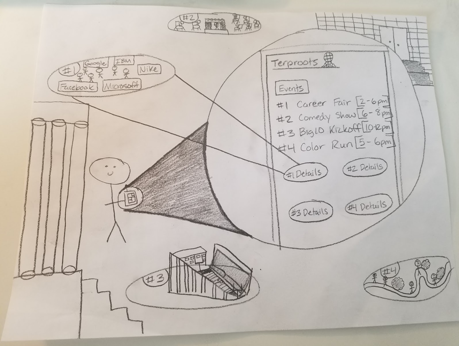
The photo above shows a more basic user interface for our application. In this example, it shows the events page that features a list of various campus events and the respective times for each event. The most innovative aspect about this design is that these events are linked directly to their real time activities. In this example, the student can view live updates about events such as the career fair, comedy show, Big 10 Kickoff and the Color Run by clicking on the details button that corresponds with the event number.

Event variety, location and updates are the requirements that are fulfilled within this sketch. The variety requirement is met by providing the student with a list of the current and upcoming campus events. We provide the location of each event by giving directions to the event and showing a preview of the event’s specific location. Users are updated on the most current events through live updates by fellow students and possibly event staff.


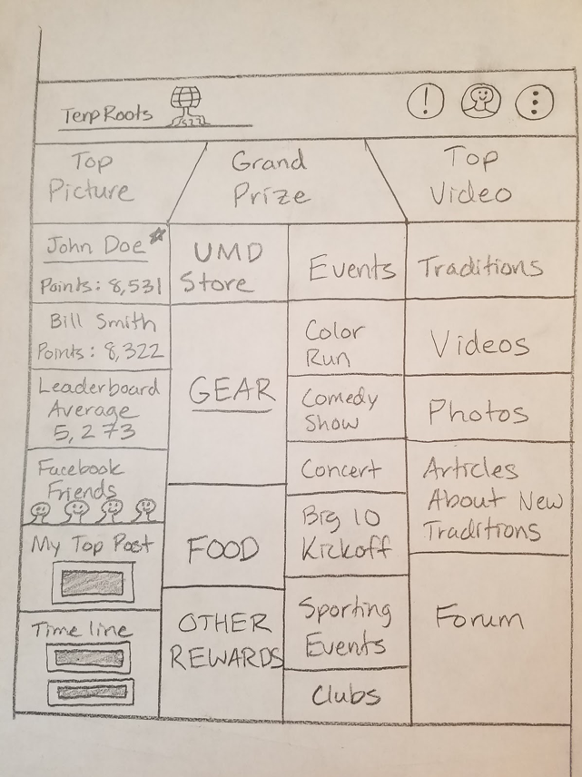
This second design is a possible mock-up of the main user interface for the TerpRoots application. This design features a more social approach as it allows users to interact with other people. This interface would act as a forum for students to communicate with each other about the quality of events and also feature things such as a live feed of user posts, an incentive/reward system based on both the quality and amount posts by individual users, and event and product advertisements.

This main user interface meets five requirements: incentives, inclusion, event variety, advertisement and update. The interface shows the variety of incentives that can be won by making posts on the interface in the middle left portion of the screen. We address the inclusion requirement by focusing on how we disseminate event information. We can reach a larger audience by disseminating the information through various platforms such as Twitter, Facebook, and Google Plus to name a few. Physical promotional materials that are usually posted around campus can be uploaded directly to the TerpRoots platform for users without social media, so they can be effectively informed as well. These physical promotional materials will be uploaded onto the TerpRoots platform when users take pictures of flyers or event information that they see around campus. Event variety is shown as a list of current and future events available on campus in the middle right column. The list of campus events also fulfills the advertisement requirement. We also advertise user content such as the top user posts of the day for both images and video that were uploaded to TerpRoots. Through the implementation of real-time posts by users that can be viewed by other members of the TerpRoots community, the updates requirement is certainly fulfilled.


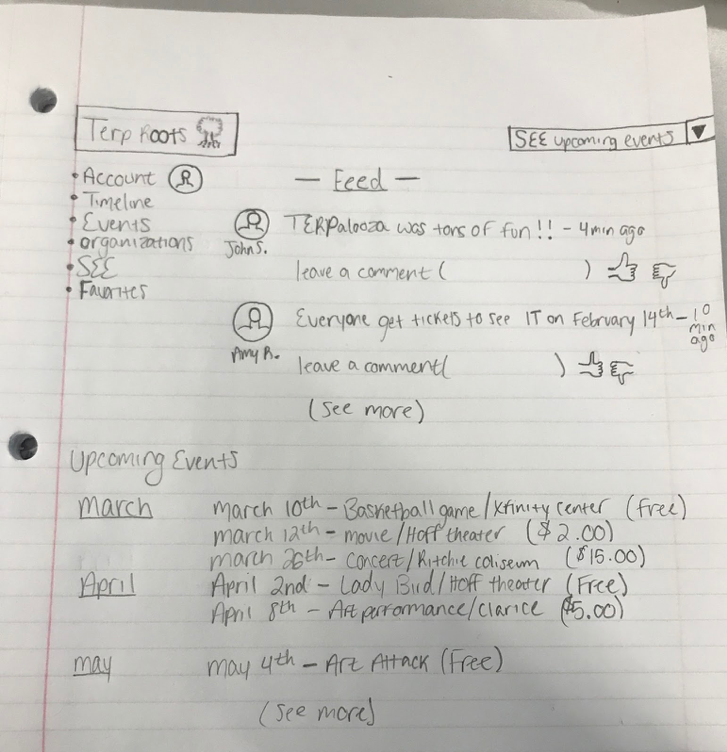
This final design shows also shows a very social design of our system and the ability it allows users communicate with each other about previous, current, and upcoming events. People will be able to post information about different events and communicate with their fellow TerpRoots users by leaving comments on other users’ posts. These posts will also feature timestamps to show relevancy in respect to real time as well and like/dislike buttons. In addition, featured on the left-hand side of this mock-up is a menu that allows you to filter through different parts of the platform such as personal information, user posts, and lists of the events offered and campus organizations and the events that they host. Another benefit of this design is that it prominently features an upcoming events calendar for users to see what events will be taking place in the near future.

This interface meets the pricing requirement because the event cost is displayed upfront and allows users to prominently see whether they would consider attending a certain event before reading its details based on the price. It is also convenient because it informs/reminds you of the date of the event and where on campus it is being held.


Prototyping


Developing & testing our system


The Creation Process:


In order to build and develop our prototype, we started by identifying the process of user interactions. We started with how the interface would fulfill the requirements from the earlier stages of the design and prototyping process. The initial sketch described how we wanted the interface to look, but the interaction and usability was our main focus for building this prototype. We planned to model how the user would interact with the application and navigate from page to page instead of going extremely in-depth on one aspect. To do this, we utilized the model of a horizontal prototype so that we could clearly display how the navigation works within the app. In the prototype, the user can see majority of the features that we have to offer so that they can get a feel of the overall functionality. We thought that this technique would be the most beneficial to present so potential users could better understand the general purpose of our system. The various sections of our prototype display screens that would show up, if the user were to interact with the app. We started with the initial screen mockup that shows our logo and organization’s name. After clicking on the main page, the user is taken to a sign-in page where they can enter their information to utilize the features of the application. The main page displays the different elements of the app and what the user has the ability to click on. For example, if you click on the upcoming events section, the user will be guided to a calendar which shows upcoming events. The calendar will show various events in the nearby future along with basic information on the upcoming events. We implemented the same process for our other features such as traditions, rewards, and news.


User Tasks & Prototype Scope:


For our prototype, our team believed it was best for us to show the both the functionality and broad range of features that TerpRoots has to offer. For previous deliverables, we wanted to include as many features our stakeholder groups wanted as possible in our work activity affinity diagram. We synthesized over 100 work notes for our WAAD, and we decided to initially include the most popular work notes from our WAAD in our prototype. We wanted to include a comprehensive range of the functionality of our application and provide a full scope of what we intended our system to do. We also wanted to make sure that our prototype wasn’t too fleshed out because we wanted to ensure that we would be able to easily modify and update the prototype when necessary. For this, we decided to include almost all of the panels and the full appearance of the application; we just didn’t fully flesh out and detail the information associated with each panel. However, for certain components with our prototype, like the archive or being able to interact with rewards, we wanted to go a little bit more in depth with the functionality by showing what the panel routes to upon clicking or touching the corresponding panel on the application. For example, we wanted to show what the user would see if they select the Terp Store icon on our application; for our prototype, there would be a transition effect that is triggered upon click, which routes to the University of Maryland online store. Another example is how we drew out the process of a user interacting with our calendar and with the events; we drew out how users would interact with events including viewing event details and using location services to check into events and earn points. Some key features that users described were more/better incentives for attending events, a way to archive pictures and videos from events, and a way to foster friendly camaraderie between students by showing a real-time leaderboard of the most active users on our forum.


Pilot Testing:


Our pilot test took place in class. While some of our team walked from project to project, one to two of our team members ran a small scaled usability pilot test. We used a digital click-through interface to guide our users through a controlled experience. One click at a time, users were led through a horizontal prototype of our end product. From signing in to browsing the UMD store, our classmates (primary users) could get a feel for the functionality of the application.

The feedback process of our pilot test was simple. Our users were asked to leave sticky notes which contained critiques, praise, and future concerns. We used these notes to judge the results of our first test.

Unfortunately for the sake of future alterations, our team received one con: “Maybe subject to advertising.” This comment, and lack of other written constructive criticism, did not give us much to work with when it came time for revisions.

Unlike the single con, our team received lots of positive feedback from our users. In total, six positive sticky notes were left at our station. Some of our favorite comments were, “Very well-thought-out application design,” “Seems real. Engaging,” and “Good idea for spreading UMD’s culture.”

In regard to future concerns, six comments were left for us. Three great concerns we received were, “Security check,” “Moderating negative posts/trolling,” and “Add RSVP so people can get the turn out and know if it’s worth going. Add something to someone’s profile if they work on campus.”

We learned that this functional digital model worked well for our application. Users had a better conceptual image of the final product when guided through the interface. And, for the most part, we heard nothing but good things. The fact that we heard so many positive comments compared to negative ones also taught us a lesson: it is better to receive negative feedback during the prototyping and testing process than if you were to receive negative feedback at launch. Receiving negative feedback before presenting your final product allows you to address the problems that you did not or could not see.

Other comments— the ones that were vocal between our team and our users— also carried some weight in our critiquing process. Compiling all of the user data and feedback, our team was asked to make two major revisions to improve global navigation for our final product: (1) Add back buttons for all of the pages (2) Add a button that will bring the user to the homepage from each page of the application. We are very appreciative of both the praises and criticisms that we received for TerpRoots. By knowing what users like and dislike, we can know what should remain and what needs to be improved in order to create the best platform possible.


Wireframes:


The first image on our prototype is the opening image and landing pager when the user opens our mobile app or loads our website. The second image is routes to the sign in page. The third image is the application is the home screen for our application after the user signs in. The fourth image shows the settings menu that is event handled upon the user clicking or tapping on the three-bullet list icon in the top right corner. The fifth image is the home page again. Our application design has multiple routes, so after an event handler is executed, the user will always be routed back to the home page.


For the second row of wireframe images, the first image shows the router module that appears when the user clicks or taps the “News” panel on the application’s home page. The second image routes back to the home page. The third image represents the archive of content posted on the TerpRoots platform that appears when the user clips or taps “Archive.” The fourth image shows the home page. The fifth image shows a calendar of events that appears when the user clicks or taps on the “Upcoming Events” panel.


For this row, the first image shows the home page and the second image appears when the user clicks or taps on the “Terp Store” panel. The user clicks or taps on a certain region of the page to return to the home page (Image 3) and Image 4 represents the timeline of content users can engage with in real-time.


TRY IT YOURSELF

Walkthrough:


Video walkthrough coming soon!


Evaluation


Assessing the quality and effectiveness of our system


Focal Evaluation Task:


The main purpose of our application is to provide the user with a platform that promotes increased involvement in UMD events and culture. That is why we chose to use the click-through Marvel prototype from Project Assignment 4 part one for our focal evaluation task. This task requires the user to walk through a series of different landing pages, which will navigate them to the calendar page which contains details of various events.

When it came to selecting recruits for our test, our team decided to divide the task amongst all five of our members. Each member of our team presented one or more friends/colleagues with the Marvel application so that they could walk through a simulation of our applications features. It was important to our team that we capture a range of demographics of potential users. We wanted data from people with different levels of involvement.

Our focal evaluation task was premised with an overview of the application, that way our users felt more comfortable with the application’s interface before beginning their task. After each user received the breakdown of the functionality of TerpRoots, we asked our peers to navigate to the page labeled “Upcoming Events.” During their navigation, our team used a hands-off approach while our peers used the application; each of the users were required to find and select the name of an event without the aid of our team members.

The flow of the task was straightforward. Initially, the users were directed to the page labeled “Sign In.” From the sign in page, the users entered their information and logged in, which then took them to the homepage. From the homepage, the user clicked on the icon located on the top right of the page, which lead them to the pages that list upcoming events. On the page of upcoming events, the user clicked on the first event that was listed, where they then received more information on that particular event. After they received this information, a back button appeared on the top left corner to return to the upcoming events page.


Data Collection Procedures:


Although user experience and usability are not directly measurable elements, we can still collect data by receiving qualitative and quantitative feedback from potential users. To do so, our team used a combination of the Think-Aloud and questionnaire techniques to collect our data. Once we told our participants an overview and purpose of the system, we gave them the task of locating the events calendar in the prototype that features a list of specific events. While our participants were carrying out our desired task, we asked them to also describe their thoughts about the system as they went through it page by page until the task was completed. We felt that by having them speaking their immediate thoughts on their assigned task would better allow us to understand the hesitations and issues they are having with the system. Our team found this direct feedback from various participants to be extremely vital because it allows us to understand issues that other potential users may run into and look for ways to improve the use of the system.

As for quantitative data, we gathered it in two ways. The first method of gathering was done by observing the number of clicks on the screen it took our user to complete our given task. We associated a higher amount of clicks with more difficulty of navigating the system. The second method was through a verbal questionnaire where we asked for Likert-scale responses, with each feeling associated with a number. The Likert-scale response options were as follows: (1) Very Dissatisfied (2) Slightly Dissatisfied (3) Neutral (4) Slightly Satisfied (5) Very Satisfied. Once receiving the participants responses, we summed up the numbers associated with each of their responses to in order to compose a composite score. Similar to the qualitative data collected, our numerical data will be used by our team to improve the design and functionality of our TerpRoots platform.


Evaluation Results:


Through the Think-Aloud and questionnaire results, we were able to analyze the data in order to evaluate our design for possible improvements. We each gathered input and responses from various individuals for the Think-Aloud prototype click through evaluation and verbal questionnaire. The Think-Aloud technique proved to be very beneficial as our team received a variety of positive and negative responses from our participants. Some of the positive responses were as followed:

“Performing the assigned task to locate the events was very straight-forward”           


“The navigation from the start of the app to the calendar was simple as possible”           


“The setup of the calendar was well thought out to include all the necessary information but also not bogged down with too much information”           


“I think this setup is pretty good; you can find everything on here that is contained need in one place quickly”           


“Getting to this calendar was pretty quick; I like that I could quickly find the events, so I can get up and go”           

Along with the good, we also received some responses from participants expressing some of the issues they had during and after the evaluation task. Here are a few of the responses:

“It’s not responding to my touch like I think it should; I’m tapping where I want to go but it’s not working”           


“I clicked on the wrong section and now I’m trying to go back so that I can get to the calendar, but it’s not working right; I can’t find the back button”           


“It did the job for sure, but I think could look better at the same time”           


“This seems low quality; I knew what to do and how to get there, but it’s not appealing to look at”           


“There’s no back button so I had to start all over to get where I needed to go”           


When conducting our field test, the metrics we were collecting were the number of clicks it took the user to go through the prototype and a questionnaire measuring the prototype’s usability. Our results are as follows:

Our first user clicked on the screen a total of 12 times in order to complete the assigned task. They scored the prototype’s usability as a 4.5 on a 5-point scale. For the second user, it took them only 10 touches on the screen to finish the task and gave a 5 out of 5 score for the usability. User number three took the most amount of touches at 15 to complete the task. They did not have as good of an experience as they gave a 3 out of 5 usability score. The next user took only 11 clicks to complete the task and gave the usability experience a 4.7 out of 5. Our final user also took only 10 touches to complete the assigned task and also had a great experience as they gave 5 out of 5 score for the usability.


Alternative Design Steps:


In the future, if we went through a second design iteration we would implement a transportation aspect of the application. This transportation application would show bus routes and current bus locations. The transportation component would also use location services to show the user how far they are from their end destination. Additionally, if we went through a second design iteration, we would make the prototype more functional by highlighting more of the features we hope to include in our prototype.